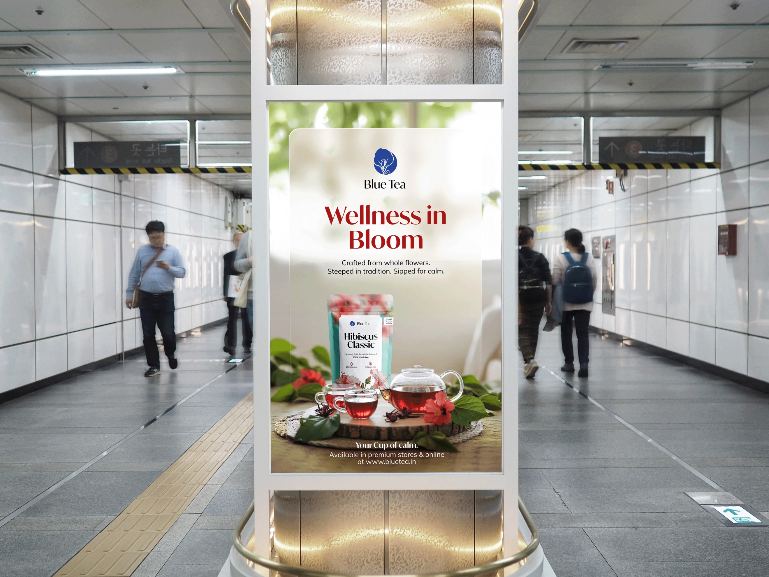
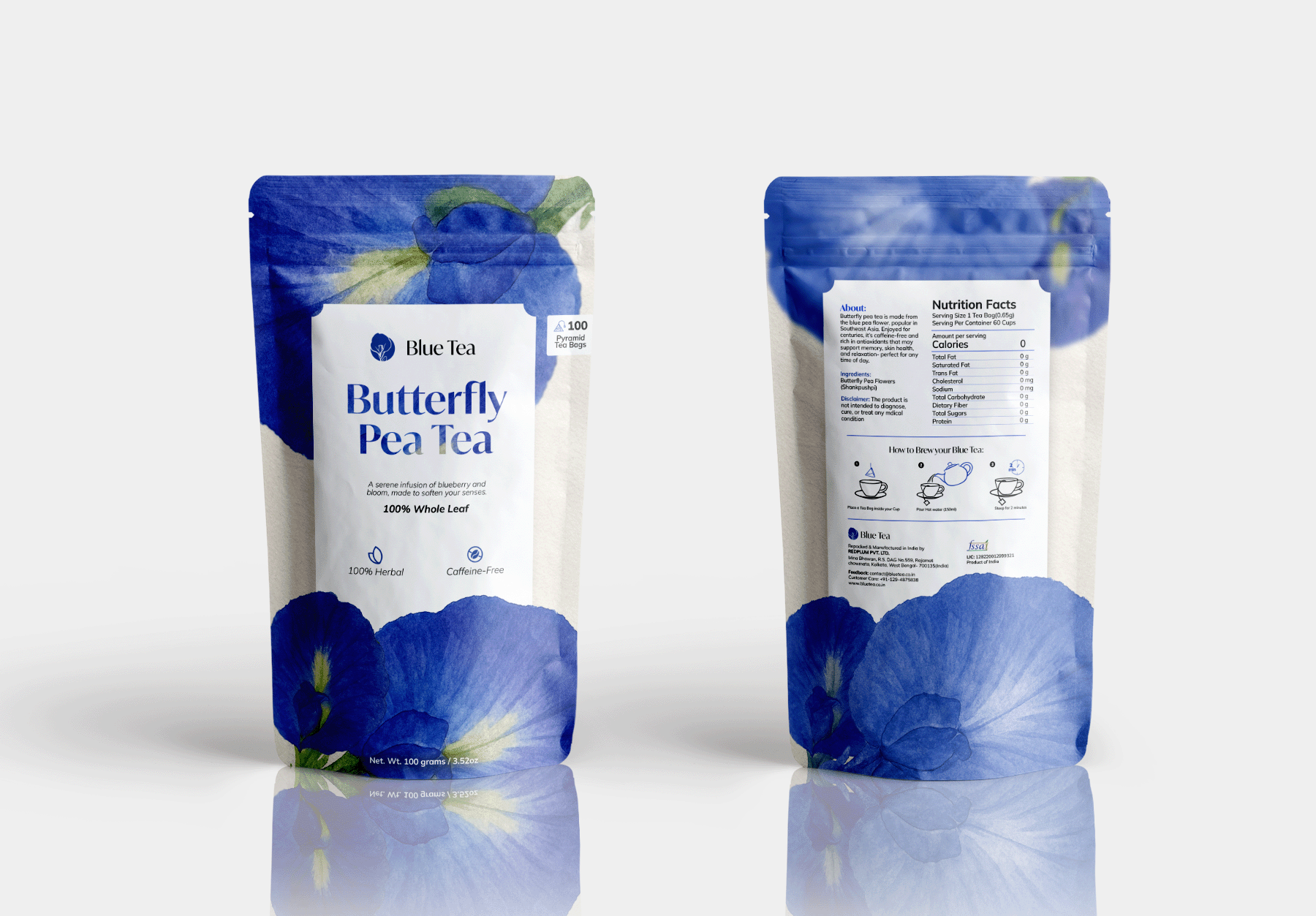
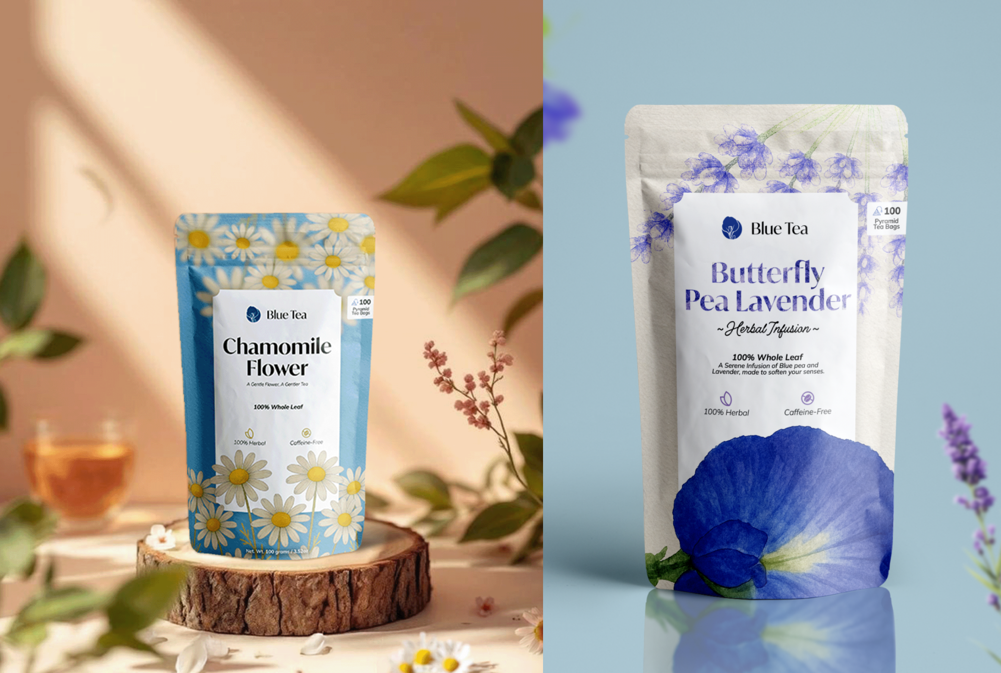
Blue Tea has always stood out for its vibrant, natural colors and calming blends. BUT its identity didn’t quite reflect the richness of the brand’s story. So, I took it up as a personal rebranding project to explore how design could better capture its essence. The goal was to bridge the gap between authenticity and elegance; keeping the organic charm intact while giving it a global, premium edge. I started by researching the herbal tea market and analyzing how Blue Tea could visually differentiate itself.
THE LINK IS BROKEN FOR NOW. FULL CASE STUDY, COMING SOON.
Blue Tea
05/2025
Logo, Packaging & Web Design